
How States and Local Governments Track Broadband Progress with Ookla’s ArcGIS Online Dashboards
Internet service has joined the ranks of essential utilities; it’s foundational to economic development, public services, and everyday life. But when it comes to understanding which areas have fast, reliable internet—and which don’t—many public sector teams are still relying on outdated information, especially federal coverage maps. Accurate, location-based performance data has been hard to come by, and even harder to put to use.
That’s where Ookla’s new ArcGIS-based dashboards come in. Built for use at every level of government—from state agencies to local broadband offices—these tools combine Ookla’s rolling 12-month Speedtest Intelligence data with powerful visualization capabilities inside Esri’s ArcGIS environment. Because they’re built on hosted layers that integrate directly with ArcGIS Online, agencies can access up-to-date connectivity data without manual uploads or custom integrations—saving time and fitting into workflows many teams already use.
From there, users can explore broadband performance by state, county, or block group (a U.S. Census-defined area used for broadband funding decisions), track monthly and year-over-year changes, and compare progress across regions—all without needing deep GIS expertise.
In this article, we’ll explore what the dashboards offer, how they’re helping public-sector teams move beyond static maps, and what early adopters like Hawaii and West Virginia are already doing with them. We’ll also look at how the dashboards are evolving to support mobile data and more flexible reporting options.
Why Better Data Visualization Matters for Broadband Planning
Public sector broadband teams—whether overseeing a small town or an entire state—face growing pressure to show where funding is needed and where progress is happening. Speedtest Intelligence provides rich, real-world performance data, and the ArcGIS dashboards help teams tap into that depth more efficiently. By simplifying access and visualization, the dashboards make it easier to explore trends, spot gaps, and communicate insights across geographies and time periods.
Here’s a closer look at how the dashboards are structured and what they include:
- Hosted in ArcGIS Online: Dashboards are delivered through ArcGIS Online and built on Ookla’s rolling 12-month median Speedtest data
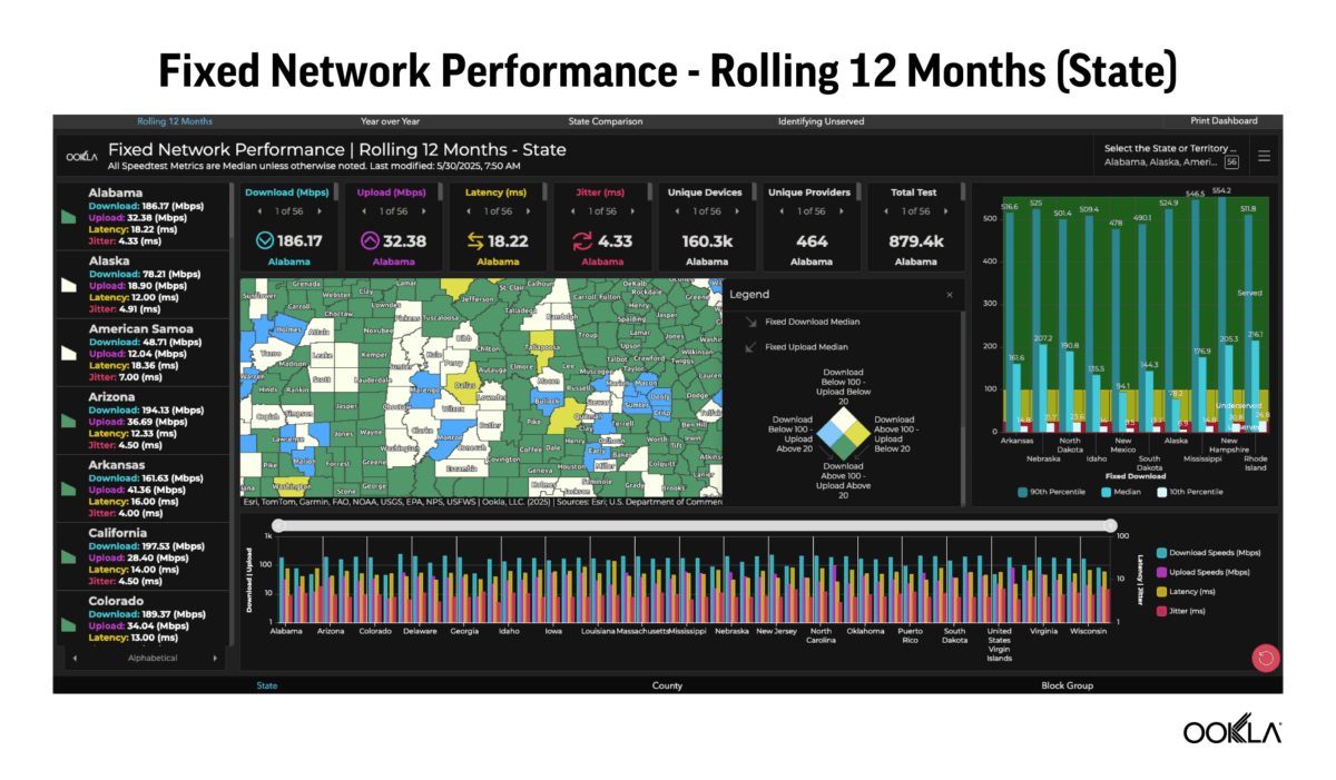
- Core metrics included: Download and upload speeds, latency, jitter, test counts, and device counts
- Flexible geographic views: Users can explore data across state, county, and block group geographies, depending on their needs
- Updated monthly: Dashboards provide near-real-time insights into performance trends
- Custom filtering and breakdowns: Visualizations support comparisons and speed breakouts by percentile (e.g., 90th, median, 10th percentile download and upload speeds)
- FCC threshold analysis: Clients can easily identify which areas meet (or fall short of) the FCC’s 100/20 Mbps benchmark for download and upload speeds.
Together, these tools help government teams to monitor broadband conditions, identify gaps, and support data-driven decisions for stakeholders and legislators.
Drilling Into the Details: Four Dashboards That Work Together
Broadband offices and policy makers need more than just numbers—they need clarity around where things are working, where they’re not, and how performance aligns with goals that matter for their communities. Understanding broadband performance means more than looking at speed metrics alone—it requires a holistic view of how connectivity performance varies across regions, how it changes over time, and whether it meets the goals tied to funding and planning.
That’s why the ArcGIS dashboards include four focused views that help teams across all levels of government track progress, compare regions, and evaluate service against meaningful benchmarks.
- Monthly Trends Dashboard: View median speeds, latency, jitter, test counts, and device counts across a rolling 12-month window. Users can filter by state, county, or block group.
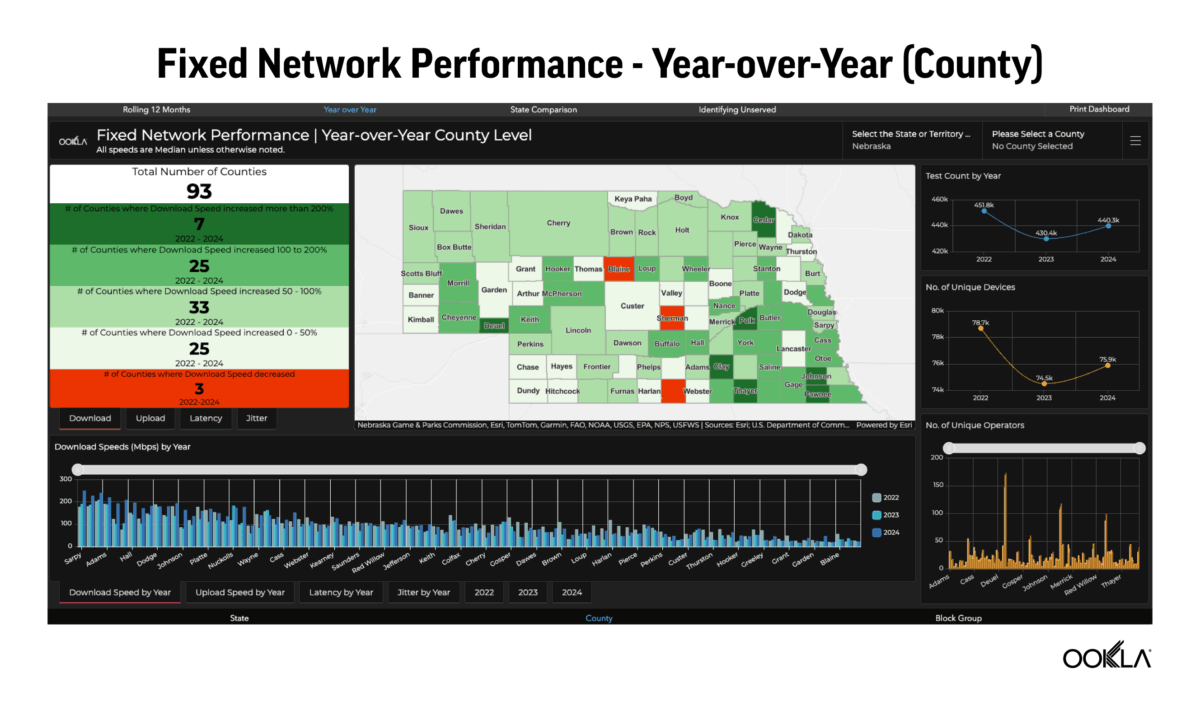
- Year-over-Year Change Dashboard: Compare current performance to previous years to see where speeds, latency, or jitter have improved—or declined. Data is broken out by geography and metric.
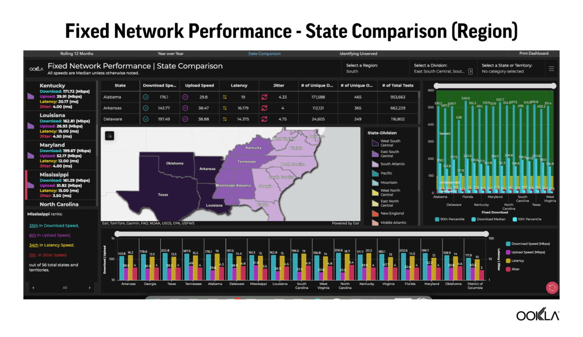
- State Comparison Dashboard: Benchmark one state’s connectivity against others in the same region, division, or across the U.S. This view is especially useful for supporting economic development and funding decisions.
- FCC Comparison Dashboard: Overlay Ookla Speedtest data with FCC broadband coverage data to flag areas where federal maps may overstate service availability.
Each view is designed to answer specific questions quickly: How are we trending? How do we compare to other states? And where do we see discrepancies that might affect funding or reporting? These supporting dashboards turn complex performance data into actionable insights for states, cities, and counties alike.
Spotting the Gaps: Where FCC Maps and Real-World Performance Don’t Align
Accurate broadband coverage data is critical when millions in funding are on the line. For broadband offices tasked with allocating those dollars, having trusted information is essential, but government maps don’t always reflect what people are actually experiencing. One of the most powerful features of Ookla’s ArcGIS dashboards is their ability to highlight the gaps between reported coverage and real-world performance in a clear, actionable way.
The dashboards make it easy to spot those discrepancies and dig into the details at a granular level:
- Hexagon-based overlays: Dashboards use hex-shaped grids to show which areas meet or fall below the FCC’s 100/20 Mbps threshold
- Drill-down insights: Users can click into individual hexes to view Speedtest performance and test counts
- Custom filters: Teams can isolate areas by number of tests, performance thresholds, or number of Broadband Serviceable Locations (BSLs)
- Flagging discrepancies: Differences between reported coverage and actual Speedtest results can help identify areas for ISP follow-up or further investigation
- Exportable data: Insights can be shared in reports or integrated into state systems for further analysis
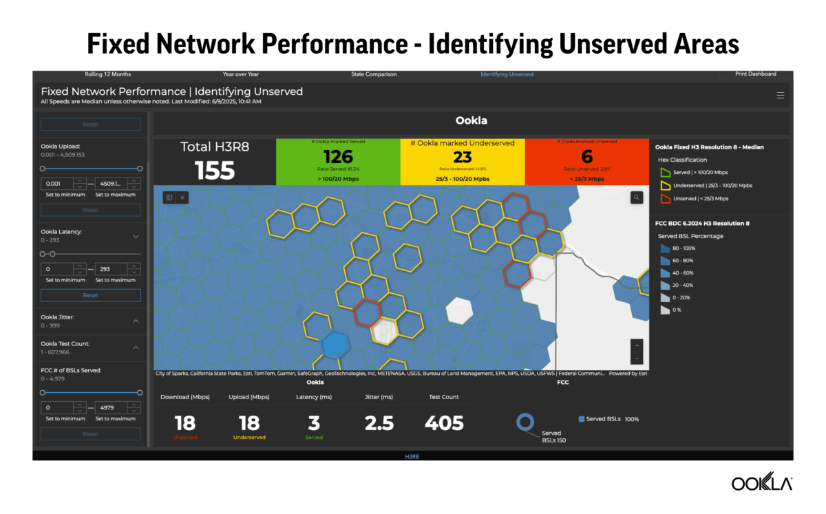
FCC broadband data still plays a central role in determining where federal funds are allocated—but it’s not always accurate. By layering Speedtest Intelligence data on top of government coverage maps, the dashboards give broadband teams a clearer way to validate service claims and advocate for resources where they’re truly needed.
Early Adoption in the Real-World
Hawaii and West Virginia are already testing these dashboards, marking the start of broader adoption. For states working to identify coverage gaps, benchmark performance, and clearly communicate broadband progress, these tools make it easier to explore the data, surface key insights, and share results with the people who need to see them.
Feedback from Hawaii and West Virginia is already shaping product development, with updates underway to support mobile datasets and more flexible, exportable reporting options:
- Fixed data available now: Fixed broadband data dashboards are already in use; mobile versions are in development
- Geography-based filtering: Dashboards are delivered pre-filtered to each state’s geography
- No advanced GIS skills needed: Designed for ease of use by teams without dedicated GIS staff
- Public-facing options: Results can be embedded into websites or shared with lawmakers and stakeholders
- Exportable reports coming soon: PDF and Word formats can help teams share insights without needing a full ArcGIS license
The dashboards are powered by Speedtest’s hosted layers—monthly-updated datasets that plug directly into ArcGIS Online. These hosted layers make it easier for agencies to access and visualize Speedtest data without dealing with manual uploads or complex integrations. For teams already using ArcGIS to track broadband or demographic data, it’s a faster path to meaningful insight.
Looking ahead
Access to accurate, actionable broadband data has always been a challenge. With these ArcGIS dashboards, states and local governments finally have a clear view of connectivity across their communities, grounded in real-world performance data they can explore and use.
Whether the goal is identifying underserved areas, tracking progress over time, or communicating results to legislators and stakeholders, Ookla’s ArcGIS dashboards give teams the tools to act with confidence.
As more states adopt the platform and new capabilities roll out, these dashboards are quickly becoming a go-to resource for building broadband strategies that reflect what’s really happening on the ground. The dashboards were also recently featured during the 2025 Esri UC Plenary Session, underscoring their growing role in public-sector broadband planning (Esri account required to view).
To learn how our ArcGIS dashboards can support your broadband planning efforts—whether you’re running a statewide program or managing broadband efforts in a single community—reach out to our team.
Ookla retains ownership of this article including all of the intellectual property rights, data, content graphs and analysis. This article may not be quoted, reproduced, distributed or published for any commercial purpose without prior consent. Members of the press and others using the findings in this article for non-commercial purposes are welcome to publicly share and link to report information with attribution to Ookla.